Going Medieval on Your Gram
Blackletter fonts find new life on politicized social media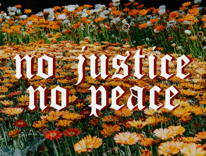 The Baffler
 o
r
d
F
a
c
t
o
r
y
Some time in the middle of last summer—between the semi-naive, early pandemic days of spring 2020 and the considerably world-wearier winter we presently inhabit—things began to feel a bit, well, medieval. I recall encountering several history-lite reports of merchants in Italy who “have revived a Black Death tradition: wine windows.” Reminders bounced around Twitter that “when Shakespeare was quarantined because of the plague, he wrote King Lear,” a claim that sparked both inspiration and consternation among the newly unemployed. I also started noticing a certain medieval aesthetic proliferate across social media platforms, especially on Instagram: calligraphic fonts often called Gothic or Old English but technically called “blackletter” were appearing on leftist infographics with phrases like “abolish the police” or quotes about social, cultural, and environmental injustice. Seeing these posts felt akin to perusing digital versions of illuminated texts or handwritten scrolls. Given the plague-ish circumstances of the coronavirus, something about this ye-aulden lettering felt fitting: serious, yet tongue-in-cheek, and almost mirroring the incredulity so many people were feeling about our own moment in history. But why, during a period of overlapping hopes for a virus vaccine and political change, had medieval script become a go-to font for sharing progressive content?
Looking back on summer 2020’s medieval undertones, perhaps there was something about the plague’s associations with Monty Python and fourth-grade history projects that felt comfortingly hyperbolic—a relic of truly different and distinctly less hygienic times. Though Covid-19 and the Spanish influenza outbreak of 1918 would be extensively compared in news reports and medical commentaries, it was the “Black Death”—which killed millions of people across Europe, Asia, and North Africa, and peaked in the fourteenth century—that achieved greater pop cultural traction. In addition to seeing numerous memes and tweets comparing coronavirus and the plague, I sunk down a research hole about St. Vitus Dance, aka “dancing mania,” a phenomenon whereby people would sometimes “dance unstoppably, for days on end,” occasionally to the point of death. Though many researchers suspect these frenetic episodes were caused by hallucinations induced by ergot poisoning from rye, others point out that not all of the regions affected would have featured the consumption of rye. In the end, the so-called “trance states” likely reflected a mixture of factors including “extreme psychological distress” arising in part from living under plague conditions. Reading about people raving in response to mortal peril felt more heartening than accounts of the Spanish flu, an epidemic seemingly too recent and relatable to be an appropriate source of gallows humor.
Was there a connection between the sudden relevance of medieval anecdotes and an apparent increase in blackletter fonts on leftist social media? If plague humor was in, so too were ornate, eye-catching fonts derived from a Gothic style. And as platforms such as Instagram evolved last summer—becoming more text-heavy, politicized, and less about the passive consumption of lifestyle imagery—text-based infographics featuring blackletter became central tools for sharing information, arguments, and calls to action. Initially, it seemed ironic, or even counterproductive, to see progressive content presented in hard-to-read typefaces with archaic connotations. Upon second glance—a look often facilitated by the act of scrolling backward to revisit a social media post—medieval-esque fonts commanded unique attention. And since last summer, blackletter has continued to be used in posts addressing the intersections of the coronavirus pandemic and violence toward marginalized communities. Not long ago, I saw a repost of @norentnoevictions’ infographic that reads “there is a future without landlords” in a two-tone pink and red blackletter; this post was originally shared on October 1 and subsequently reposted by dozens of organizations and individuals across North America. Another example of the blackletter style appears on Niria Alicia’s Instagram: the Xicana organizer and educator regularly employs a bold blackletter to format messages about community care, healing, and allyship.
Text-based infographics featuring blackletter became central tools for sharing information, arguments, and calls to action.
Blackletter is a term now broadly inclusive of stylized Gothic or old-timey scripts that are equally likely to appear on hip streetwear or traditional English pub signage. Technically speaking, it refers to a typeface “based on early manuscript lettering” that features “dramatic thin and thick strokes, and in some fonts, [elaborate] swirls on the serif.” It came to typographical prominence when textualis, a version of blackletter, was used in the Gutenberg Bible. Printed in the 1450s in Mainz (a city in present-day west central Germany), the Gutenberg Bible was one of the first books widely distributed in Europe thanks to advancements in printing press technologies. Its far-reaching circulation made blackletter the typeface de rigueur for decades to come for both religious and secular texts. The face’s strong associations with Christianity imbued it with a gravitas that simultaneously laid the foundations for blackletter’s potential iconoclastic reinterpretation in the future, i.e., as taken up in the twenty-first century as a vehicle for sharing radical political content.
Within print culture, blackletter’s popularity mostly waned toward the end of the fifteenth century, with the exception of Germany and German-speaking countries. While other European states began using “sparer and more vertical” Roman faces, which were simpler to arrange at the printers and easier to read, blackletter held strong in Germany well into the twentieth century. Despite the Nazi party’s later-stage professed interest in Bauhaus-influenced sans serif typefaces like Futura, which were seen as modern and forward-looking, early Nazi propaganda cemented a strong connection between blackletter and German nationalism. In 1941, Hitler banned Fraktur, the quintessential German blackletter, based on claims Fraktur was Jewish in origin, but perhaps also out of concerns about Nazism being interpreted as old-fashioned. Many historians speculate that Hitler’s reasoning ultimately “had more to do with the logistics of occupying countries reliant on Latin typefaces.” In any case, the severe Gothic typeface would retain strong ties with Nazism and continues to carry far right associations even today.
Still, the Gothic typeface means different things to different people: on the front page of publications such as the New York Timesor the Washington Post, the stylized blackletter nameplate projects tradition and authority. On the cover of albums by heavy metal bands such as Black Sabbath and Megadeth, it projects anarchy, iconoclasm, and almost cartoonish foreboding. Arguably, the foundation for blackletter’s current digital resurgence can be linked to its rehabilitation in the distinct, yet deeply entwined, realms of streetwear and luxury apparel. Both of those modes reflect the influence of Chicano aesthetics on American typography and design. “Cholo writing,” a “style of graffiti used by Mexican gangs in Los Angeles” with “roots in curiously formal calligraphic and black letter traditions,” has long been used on gang memorial shirts. This practice of printing Gothic-style names, dates, and epitaphs on shirts and hoodies would be extensively sampled by skater, heavy metal, streetwear, and runway fashion scenes during the late twentieth century. A memorial shirt collaboration between artist Cali Thornhill Dewitt and Kanye West—a project that would get infamously “copied by Forever 21”—brought Cholo writing to the masses, while Dewitt and West’s own potential appropriation flew under the radar. In a 2016 piece for theNew York Times titled “Vetements, Brioni and Kanye Agree: It’s Gothic Time,” Max Berlinger would attest, “Thanks to its longevity, the [Gothic] typeface has accrued a wide range of cultural associations and the versatility to convey both a sense of reverential authority and rebellion.”
As the coronavirus focused attention on the complex interconnections between social, economic, and racial inequities last summer, blackletter was redeployed in the context of politicized social media posts. Specifically, the pressure cooker combination of Covid-19 and widespread protesting against police brutality after the murder of George Floyd on May 25 led to a tsunami of Instagram infographics. As well, mass lockdowns and unemployment due to the coronavirus meant more people were at home and dependent on digital engagement and communication, leading to an uptick in the creation and sharing of political posts. These circumstances plus recent updates to Instagram—specifically “the “feature introduced in May 2018 that lets you share other accounts’ posts to your story”—and innovative campaigns by Black Lives Matter and other activist groups meant the platform got a far-reaching political makeover.
On Instagram, text-based infographics usually appear as blown-up, graphic lettering overlaid on a photograph, illustration, or plain background. And, as writers Emily Stewart and Shirin Ghaffary observed in a Recode piece in June, political content has exploded on Instagram: “To many organizers, activists, and artists, Instagram’s focus on racial justice feels like a pronounced change in the usual mood on the platform.” Acknowledging critiques of potential “performative wokeness” germane to infographic posting and sharing, Stewart and Ghaffary suggest that summer 2020 reflected a genuine shift in user intention. The Recode writers contend that Instagram’s “visual focus is particularly useful for sharing complex ideas more simply, via images rather than blocks of texts.” Infographics arguably offered a happy medium: a means of sharing text that was still designed to look appealing—or at least interesting—to users exposed to thousands of images every day.
Perhaps because of its capacity to slow the eye and invite focus, blackletter has flourished there—as well as in that murky and heterogenous terroir known as the political left. For instance, Verso Books, the radical United States and UK publisher, has been using a contemporary—and noticeably more legible—take on a blackletter-style font to post quotations and calls for political action via Instagram. In the case of the former, a phrase by George Lipsitz, professor of Black studies and sociology at the University of California Santa Barbara (excerpted from Futures of Black Radicalism, ed. Gaye Theresa Johnson and Alex Lubin, 2017) appears in a post from June 25 with red, smooth-serif letters over a photo of roses against a blue sky that read: “Resistance plants the seeds of a new society within the shell of the old.” Earlier in the spring, Verso posted the succinct imperative “abolish ice” in a drop shadow Gothic font with lowercase, white-on-pink letters atop a backdrop of pastel clouds equally likely to appear on a Millennial mood board.
Much like the plague, blackletter’s legacy shows no sign of diminishing.
You can see creative uses of the blackletter style in the posts of Instagrammer @salt.xmt, whose bio line reads “Xicana Marxist tho(ugh)ts.” In a carousel—Instagram’s term for a multi-image post—featuring black, lowercase blackletter overlaying a background drawing of a white heart and pale rainbow background, the five-panel post begins with “social capital is still capital” and ends: “do not let guilt determine how your solidarity takes shape.” Another example: @SeedingSovereignty, an Indigenous-led collective with nearly three hundred thousand followers, shared a post originally created by @lamalayerbalove: “honoring our ancestors in a daily practice” appears in white blackletter overlaid atop a cluster of orange marigolds. Sometimes the original infographics are unaltered, in other cases, an Instagram user sharing a different account’s post might add their own comments to the shared version—potentially to nuance, challenge, or affirm the original content and in effect contribute to a body of semi-public, digital marginalia.
In the early days of printing, proto-influencers would distribute pamphlets responding to contemporary religious and political happenings—the image of an impassioned Martin Luther wielding the Ninety-five Thesesand a hammer comes to mind. Much like in the pamphleteering days of yore, understanding the nuance and intention behind specific social media infographics requires an awareness of context. In other words, an infographic can’t present the whole picture or even an entire argument; rather, they work as tools for propaganda or consciousness-raising. They can point social media users toward additional information and resources. The fact that blackletter leapt beyond the realms of fashion and far right propaganda and back into digitally based print culture last year suggests that the typeface’s power never really diminished. So while it’s challenging to envision leftist protesters using blackletter on physical signage or publishers selecting Gothic font for long-form texts again, it appears the typeface’s iconoclastic history has charged it, at least for the time being, with a sense of urgency and aesthetic relevance.
If Berlinger is right that Gothic fonts are uniquely able “to convey both a sense of reverential authority and rebellion,” during 2020 blackletter seemed capable of signifying a perfect admixture of self-awareness, grandiosity, irony, and style to reflect the shift, especially on Instagram, toward earnest political engagement. If the optical challenges of reading blackletter draw users’ attention back to text itself, it makes sense that Gothic fonts took off last summer while so many people were looking at their phones with dispassionate regularity, requiring a jolt in order to actively focus. Blackletter’s contemporary associations with aesthetically engaged subcultures may have even paved its way toward bestowing formality and reverence on social media, qualities urgently needed to address 2020’s combined reckoning with a global health crisis and systemic racial injustice. Its current popularity will no doubt fade or inverse—perhaps will even be seen as tacky and overused or tarnished by its reactionary twentieth-century history. For now, though, much like the plague, blackletter’s legacy shows no sign of diminishing.